Astor Wine—
UI/UX Case Study
I completed this project as a case study for an online Figma UI/UX Design course taught by Daniel Scott. My goal with this class was to familiarize myself with the Figma software and to improve my UI/UX Design skills.
I learned a lot and really enjoyed the process of developing and designing all the components and creating a cohesive branding system.
Project Brief—
Although the original brief used the name Astro, I changed it to Astor because I thought that better conveyed a sense of elegance and exclusivity.
With this persona, I wanted to create a site that was elegant and sophisticated, but also not intimidating to someone who is new to wine buying.
Because Tayla doesn’t have a secondary degree, he may feel a little out of his element in the world of fine wines. I wanted to create a site that made him feel like he belonged among the wine connoisseurs.
Mood Board—
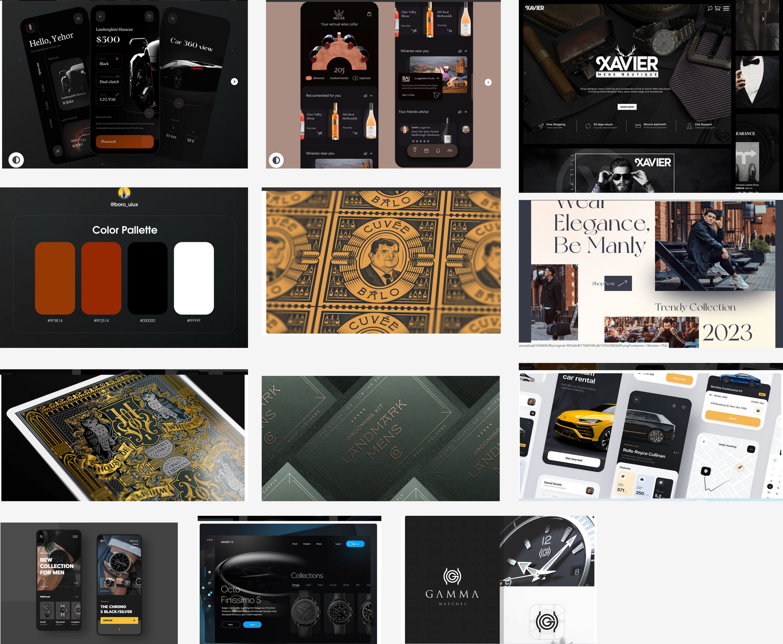
For inspiration I looked to luxury brands that target male audiences.
I noticed that the designs tended to be dark, particularly black or dark green, with metallic accents.
The fonts were usually a clean, slim type—usually serif— and a distinctive decorative logo font.
Wire Frames—
I started out creating some simple wire frames for the prototype. This helped me get an idea how to manage spacing and layout before getting into the design too deeply.
Styles & Components—
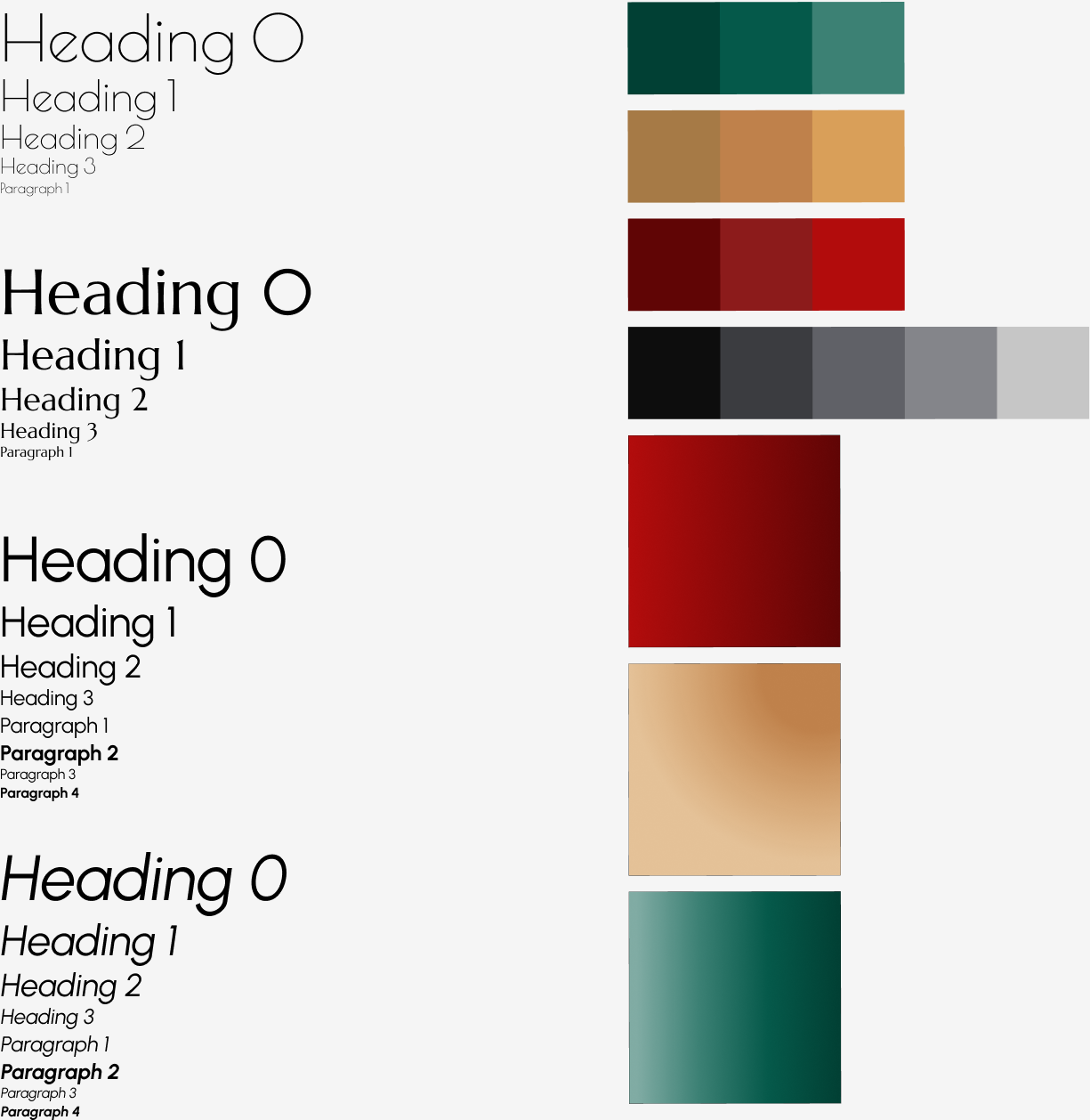
To achieve a cohesive design I created a number of site styles and components. The class covered adding versions and variants to the components for ease of design.
I chose three fonts—Poiret One, Marcellus, and Urbanist. I ended up not using the Urbanist font because it was too informal and didn’t convey the sense of luxury that I was hoping to achieve.
I used a dark green as a my primary color as it is sophisticated, but also inviting and since my user is new to this type of purchase, I wanted to make him feel comfortable on the site. I added a dark red and a gold color as accents because they feel elegant and also reflect the color of red and white wines.
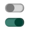
I created a number of additional components for the course—some of which didn’t fit into the end design, such as a toggle switch and check boxes.
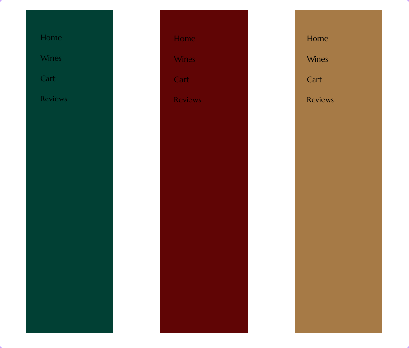
I designed a simple word mark logo for the project and created a mobile and desktop version of the navigation header
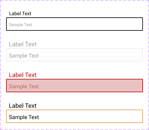
I created a generic form component with variants that I could easily turn into a checkout form.
Mobile Prototype—
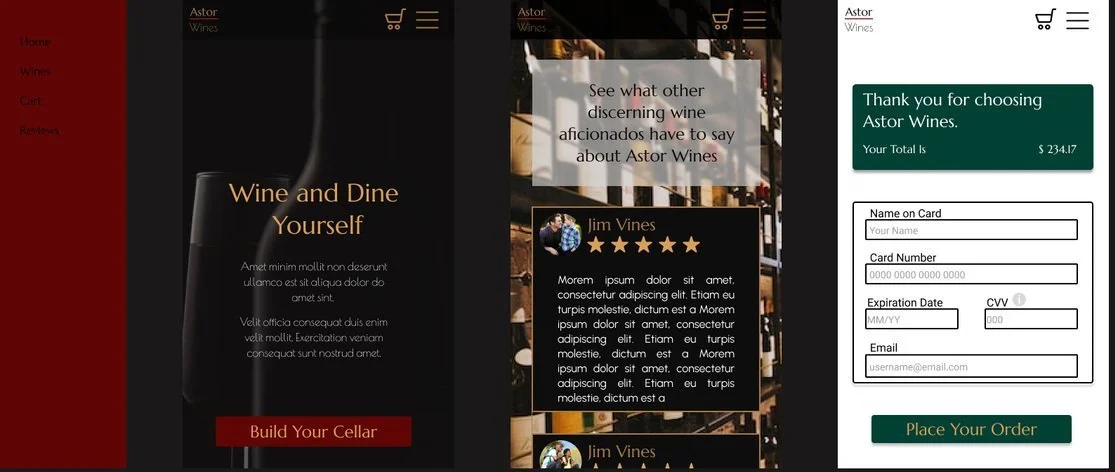
In creating the mobile prototype, I implemented the various components into the design.
I also created some basic animations, including a menu slider.
Desktop Prototypes—
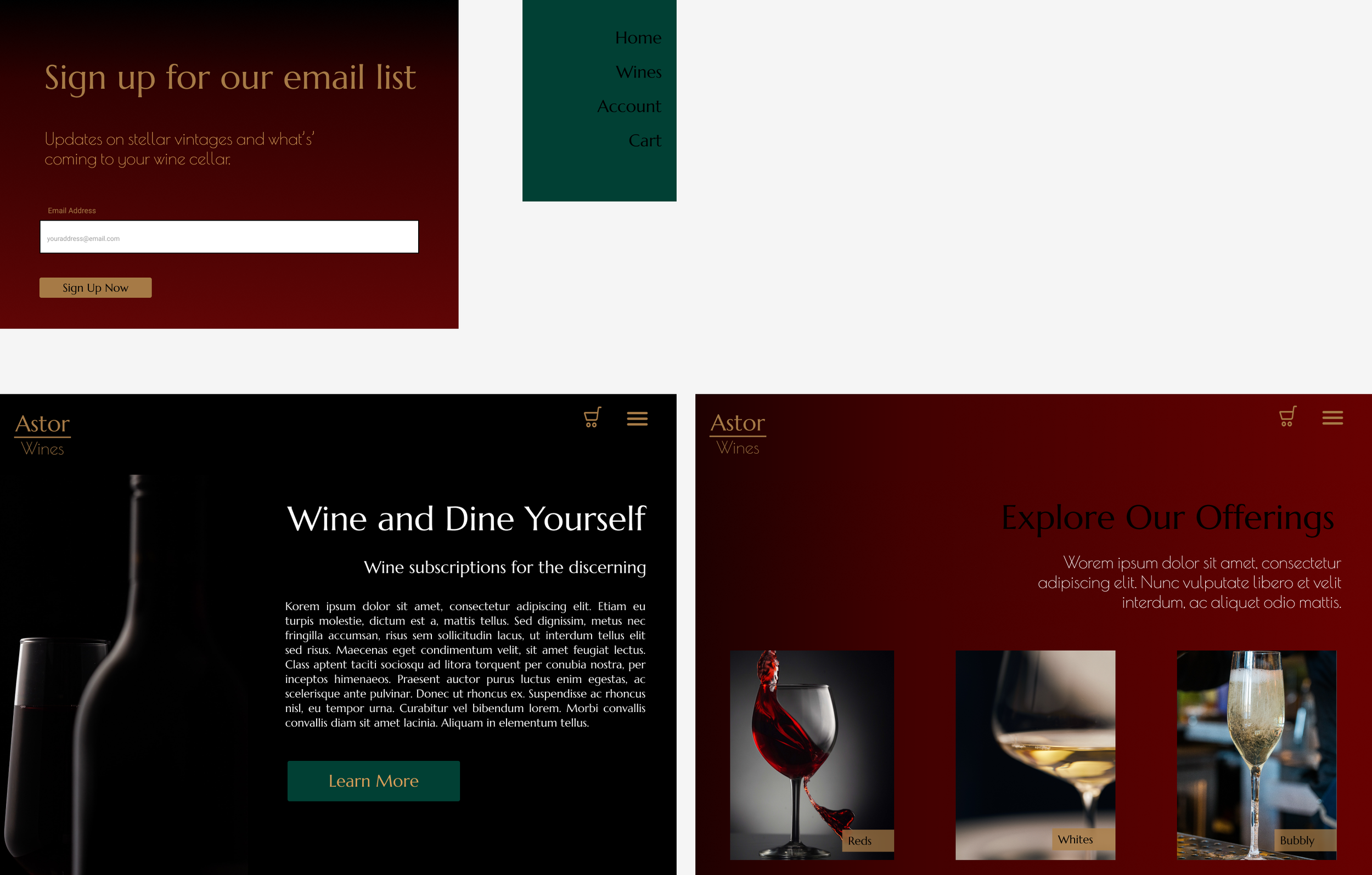
I created a few prototype screens for a desktop version of the site. The course focused more on mobile app UI/UX design and prototyping, but many of the principles apply to desktop versions.
The color palette and other styles and components carry over into the desktop version of the design.
Conclusion—
I found this course to be very informative and thorough. My understanding of UI/UX Design improved throughout the course as well as my familiarity with Figma.
I now have a good grasp of many UI/UX skills and techniques that I can use in future projects.
If you have branding needs or want to create a cohesive user interface and experience, I would love to help you.

